To build a form, follow these steps:
-
Inside the Automation Builder, select an Activity or Trigger.
-
In the Details panel, find the Form section and click Edit.
This will open the Form Builder. Here’s what you’ll see in the Form Builder:
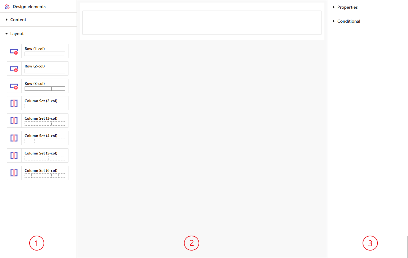
The Form Builder has three main parts:
- Palette
Contains all the content and layout elements. - Canvas
The area where you build your form. - Details
Shows properties and settings for the selected element.
When you first open the Form Builder, you'll see a Form on the Canvas with a single Row.
Let's look at how to arrange content.
Layout
Use Row and Column Set layout elements to organize your form's content. You can find these layout elements in the Layout section of the Palette.
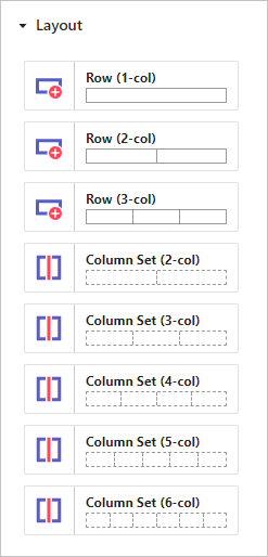
Rows
Rows hold the main content of a form. You can have as many rows as you need. Each row can have one to three Columns. These Columns can be split into smaller sections using Column Sets.
When you select a Column in a Row, you can adjust these properties:
| Property | Description |
|---|---|
| Border | Choose whether the Column should have a border. |
| Group Arrays | Decide whether Input or Output Arrays should be grouped - see here for further detail. |
Column Sets
A Column Set lets you split the columns in a Row into smaller sections. This helps you organise and display Content better on the form.
When you select a Column in a Column Set, you can set these properties:
| Property | Description |
|---|---|
| Border | choose whether the Column should have a border. |
Content
To display your form's content, use elements from the Content section in the Palette.
Drag these elements from the Palette and drop them into a Column within a Row or a Column Set.
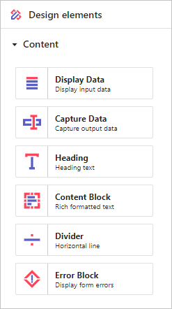
Let's take a look at each of these Content elements in turn.
Display Data
A Display Data element displays Input data from an Activity on a Form. Drag the Display Data element into a Column. Then, in the Details panel, pick the Input data you want to show.
All Display Data elements share these common properties to customize how the information appears:
| Property | Description |
|---|---|
| Label | Text accompanying the displayed information. |
| Label color | Color of the label text. |
| Label weight | Makes the label text bold or normal. |
| Label size | Adjusts the label text size. |
| Label position | Positions the label text above or to the left of the Input data. |
| Content color | Color of the Input data value. |
| Content size | Adjusts the size of the Input data value. |
Additional properties depend on the type of Input data:
Number
Properties specific to displaying number values:
| Property | Description |
|---|---|
| Display format | How the Input data value is shown; see here for further details on formatting. |
Logical
Properties specific to displaying logical values:
| Property | Description |
|---|---|
| Display format | How the Input data value is shown; see here for further details on formatting. |
Date
Properties specific to displaying date values:
| Property | Description |
|---|---|
| Display format | How the Input data value is shown; see here for further details on formatting. |
Time
Properties specific to displaying time values:
| Property | Description |
|---|---|
| Display format | How the Input data value is shown; see here for further details on formatting. |
Date/Time
Properties specific to displaying date/time values:
| Property | Description |
|---|---|
| Display format | How the Input data value is shown; see here for further details on formatting. |
TextArray
Properties specific to displaying arrays of text values:
| Property | Description |
|---|---|
| Display on single line | Whether the Input data values should be shown on one line or multiple lines. |
| Single line separator | If the Input data values are shown on one line, the text to use between each value. |
NumberArray
Properties specific to displaying arrays of number values:
| Property | Description |
|---|---|
| Display format | How the Input data value is shown; see here for further details on formatting. |
| Display on single line | Whether the Input data values should be shown on one line or multiple lines. |
| Single line separator | If the Input data values are shown on one line, the text to use between each value. |
LogicalArray
Properties specific to displaying arrays of logical values:
| Property | Description |
|---|---|
| Display format | How the Input data value is shown; see here for further details on formatting. |
| Display on single line | Whether the Input data values should be shown on one line or multiple lines. |
| Single line separator | If the Input data values are shown on one line, the text to use between each value. |
DateArray
Properties specific to displaying arrays of date values:
| Property | Description |
|---|---|
| Display format | How the Input data value is shown; see here for further details on formatting. |
| Display on single line | Whether the Input data values should be shown on one line or multiple lines. |
| Single line separator | If the Input data values are shown on one line, the text to use between each value. |
TimeArray
Properties specific to displaying arrays of time values:
| Property | Description |
|---|---|
| Display format | How the Input data value is shown; see here for further details on formatting. |
| Display on single line | Whether the Input data values should be shown on one line or multiple lines. |
| Single line separator | If the Input data values are shown on one line, the text to use between each value. |
DateTimeArray
Properties specific to displaying arrays of date/time values:
| Property | Description |
|---|---|
| Display format | How the Input data value is shown; see here for further details on formatting. |
| Display on single line | Whether the Input data values should be shown on one line or multiple lines. |
| Single line separator | If the Input data values are shown on one line, the text to use between each value. |
FileArray
Properties specific to displaying arrays of files:
| Property | Description |
|---|---|
| Display on single line | Whether the Input data values should be shown on one line or multiple lines. |
| Single line separator | If the Input data values are shown on one line, the text to use between each value. |
PersonArray
Properties specific to displaying arrays of people:
| Property | Description |
|---|---|
| Display on single line | Whether the Input data values should be shown on one line or multiple lines. |
| Single line separator | If the Input data values are shown on one line, the text to use between each value. |
Capture Data
A Capture Data element gathers information on the form linked to an Activity or Trigger. Drag the Capture Data element into a Column. Then, in the Details panel, select the Output data you want to capture.
Each Output data item can only be used once per form. After linking an Output data item to a Capture Data element, it will no longer be available in the selection list.
All Capture Data elements have these common properties to customize how the captured information appears:
| Property | Description |
|---|---|
| Label | Text accompanying the capture widget. |
| Label color | Color of the label text. |
| Label weight | Makes the label text bold or normal. |
| Label size | Adjusts the label text size. |
Additional properties depend on the type of Output data:
Text, TextArray
Properties specific to capturing text values:
| Property | Description |
|---|---|
| Full width | Decide if the widget should use the full width of the column it is placed in. |
| Capture type | Choose if the widget supports Single line or Multi-line capture. |
| Resize | If Capture type is Multi-line, choose if widget can be resized: options are None, Both, Horizontal, Vertical. |
| Placeholder | A hint or example of the expected information format or type. |
| Error separator | Text to use between errors if there are multiple errors reported for the field. |
Number, NumberArray
Properties specific to capturing number values:
| Property | Description |
|---|---|
| Full width | Decide if the widget should use the full width of the column it is placed in. |
| Placeholder | A hint or example of the expected information format or type. |
| Error separator | Text to use between errors if there are multiple errors reported for the field. |
Logical, LogicalArray
Properties specific to capturing logical values:
| Property | Description |
|---|---|
| Capture type | Choose the widget to capture the logical value: Checkbox, Button Group, Radio Group, or Dropdown. |
| Checkbox type | If Capture type is Checkbox, choose either Checkbox or Toggle button. |
| Label position | If Capture type is Checkbox, choose either Left or Right. |
| Vertical | If Capture type is Radio Group, choose whether the Radio Group should be displayed horizontally (No) or vertically (Yes). |
| Searchable | If Capture type is Dropdown, choose whether the dropdown selection is searchable. |
| Clearable | If Capture type is Dropdown, choose whether the dropdown selection can be cleared. |
| Error separator | Text to use between errors if there are multiple errors reported for the field. |
If the Capture type is Button Group, Radio Group, or Dropdown, use Edit labels to set the labels for the logical values (TRUE and FALSE).
Date, DateArray
Properties specific to capturing date values:
| Property | Description |
|---|---|
| Clearable | Choose whether the date value can be cleared. |
| Full width | Decide if the widget should use the full width of the column it is placed in. |
| Capture format | How the value is shown; see here for further details on formatting. |
| Placeholder | A hint or example of the expected information format or type. |
| Error separator | Text to use between errors if there are multiple errors reported for the field. |
Time, TimeArray
Properties specific to capturing time values:
| Property | Description |
|---|---|
| Full width | Decide if the widget should use the full width of the column it is placed in. |
| Placeholder | A hint or example of the expected information format or type. |
| Error separator | Text to use between errors if there are multiple errors reported for the field. |
Date/Time, DateTimeArray
Properties specific to capturing date/time values:
| Property | Description |
|---|---|
| Clearable | Choose whether the date value can be cleared. |
| Full width | Decide if the widget should use the full width of the column it is placed in. |
| Date capture format | How the date value is shown; see here for further details on formatting. |
| Date placeholder | A hint or example of the expected information format or type. |
| Time capture format | How the time value is shown; see here for further details on formatting. |
| Time placeholder | A hint or example of the expected information format or type. |
| Error separator | Text to use between errors if there are multiple errors reported for the field. |
Choice, ChoiceArray
Properties specific to capturing choice values:
| Property | Description |
|---|---|
| Capture type | Choose the widget to capture the logical value: Button Group, Radio Group, or Dropdown. |
| Vertical | If Capture type is Radio Group, choose whether the Radio Group should be displayed horizontally (No) or vertically (Yes). |
| Full width | If Capture type is Dropdown, choose if the widget should use the full width of the column it is placed in. |
| Placeholder | If Capture type is Dropdown, a hint or example of the expected information format or type. |
| Searchable | If Capture type is Dropdown, choose whether the dropdown selection is searchable. |
| Clearable | If Capture type is Dropdown, choose whether the dropdown selection can be cleared. |
| Error separator | Text to use between errors if there are multiple errors reported for the field. |
Use Edit item labels to set the labels for the choice values.
File, FileArray
Properties specific to capturing files:
| Property | Description |
|---|---|
| Placeholder | A hint or example of the expected information format or type. |
| Error separator | Text to use between errors if there are multiple errors reported for the field. |
Person, PersonArray
Properties specific to capturing person values:
| Property | Description |
|---|---|
| Full width | Decide if the widget should use the full width of the column it is placed in. |
| Placeholder | A hint or example of the expected information format or type. |
| Searchable | Decide whether the dropdown selection is searchable. |
| Error separator | Text to use between errors if there are multiple errors reported for the field. |
Heading
A Heading is text that explains what the next part of the form is about. To use it, drag the Heading element into a Column.
A Heading element has these properties:
| Property | Description |
|---|---|
| Text | The heading text. |
| Align | Set the heading text alignment to Left, Center, or Right. |
| Colour | Choose the colour of the heading text. |
| Heading size | Select the heading size from Heading 1 (largest) to Heading 6 (smallest). |
Content Block
A Content Block lets you create rich content by adding text, images, videos, and tables to your form. You can also include Input data within your content. To use it, drag the Content Block into a Column.
To create and edit content, click the  in the block.

This opens the Content Block editor, shown below.

The Content Block editor makes it easy to create and format your content. To insert Input data, type the 'at' symbol @ and a list of all available Input data will appear for you to choose from.
Divider
A Divider adds a horizontal line to your form, helping you separate content. To use it, drag the Divider element into a Column.
The Divider element has these properties:
| Property | Description |
|---|---|
| Colour | Choose the colour of the horizontal line. |
| Size | Choose the thinkness of the horizontal line. |
| Text | Text displayed alongside with the line. |
| Text weight | Makes the text bold or normal. |
Error Block
Form errors, like missing or invalid data, appear under the relevant form widgets. To show all errors in one place, such as at the top or bottom of the form, use an Error block. This block displays all form-related errors. To use it, drag the Error block into a Column.
The Error block has these properties:
| Property | Description |
|---|---|
| Heading text | The heading text. |
| Align | Set the heading text alignment to Left, Center, or Right. |
| Heading size | Select the heading size from Heading 1 (largest) to Heading 6 (smallest). |
Conditional Logic
Conditional logic lets you decide if a form element is visible or hidden. For Capture elements, it controls whether they are enabled or disabled. It helps you keep forms simple by showing or hiding elements based on user input.
Types of Conditional Logic:
- Show/Hide conditions
- Enable/Disable conditions
Show/Hide Conditions
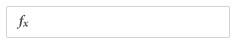
Show/Hide conditions apply to all form elements, including Rows, Columns, and Column Sets. The default option is Show always, meaning the element is always visible. Other options are Show when and Hide when. Selecting one of these options will display a formula (fx) input box:
Click the formula input box to open a Formula editor dialog, where you can enter your formula.
For a Show when condition, the element will be shown if the formula returns TRUE; otherwise, it will be hidden.
For a Hide when condition, the element will be hidden if the formula returns TRUE; otherwise, it will be shown.
Learn more about Conditional Logic formulas.
Enable/Disable Conditions
Enable/Disable conditions apply only to Capture elements. The default option is Enable always, meaning the element is always enabled. Other options are Enable when and Disable when. Selecting one of these options will display a formula (fx) input box:
Click the formula input box to open a Formula editor dialog, where you can enter your formula.
For an Enable when condition, the element will be enabled on if the formula returns TRUE; otherwise, it will be disabled.
For a Disable when condition, the element will be disabled if the formula returns TRUE; otherwise, it will be enabled.
Learn more about Conditional Logic formulas.
Arrays and Group Arrays
Capture Data can be either single-valued or multi-valued. Single-valued data captures one value on a form. Multi-valued data captures several values. When you add a Capture Data element for Output data that is an array, Add and Delete buttons appear to let users add and remove values values.
For forms needing the same number of items in different arrays (like SKU, Quantity, Price, and Description on an order form), use the Group Arrays property of a Row. This shows a single Add and Delete button for the group, ensuring all arrays stay in sync.
When using Group Arrays, you can choose how elements are arranged:
- As Table: Best for a few elements. Organizes the array group as a table with column headings. Rows are added or removed with the Add or Delete buttons.
- As Panel: Best for many elements. Offers more layout options, allowing you to include Headings, Content Blocks, and other elements. Each time Add is clicked, a new panel appears with your custom layout.
As Table has some restrictions:
- Only one capture element per column.
- Elements within a Column Set must be added to columns within the set, not to the containing column.
- Only Capture Data and Display Data elements can be added; other elements like Content Blocks and Headings will be ignored.
Let's take a look at the differences between individual arrays and grouped arrays:

Individual (non grouped) arrays each have their own Add button. A user can add different numbers of items in each of the arrays, as shown below.

Using the Group Arrays property on a Row Column combines all the Add buttons into one, making sure each array has the same number of items.


When you select Group Arrays you can control how the elements are arranged on the form. The options are As Table or As Panel.
If you have just a few elements, then choose As Table. This will organise the array group as a table, with a heading label for each column and rows added or removed if you select Add or Delete buttons.
If you have more elements that will fit in a table, select the As Panel option. This gives you more layout options and allows you to add Headings, Content Blocks and other elements. With As Panel selected, each time a user clicks Add, a new panel will appear with elements arrange as per your layout.
The As Table options comes with a few restrictions. Only one capture element can be added per Column; any more elements will be ignored. If you subdivide using Column Set, you cannot add elements to the Column containing the Column Set; only columns within the Column Set. Also, you can only add Capture Data elements and Display Data elements, You cannot add Content Block, Heading or any other type of element; these will be ignored.
You can combine Input data and Output data in the same array group. The table will show as many rows or panels as the array with the most items.
When you mix Input data, the Add and Delete buttons are removed. This helps if you want users to add new information to supplement existing information.
Data validation
Data validation checks that the Output data linked to a Capture Data element is correct. When you add Capture Data elements to a form, they are linked to an Output data element that may have a Validation formula. Validation formulas return TRUE if the entered data is valid and FALSE if it is not.
The Form applies these Validation formulas to the Output data captured on the form. It shows error messages underneath the Capture Group element and groups errors from different Capture Data elements in an Error block.
In summary, the Form enforces validation rules.
Learn more about Validation formulas.
 ON THIS PAGE